Projects & Creative Work
Portfolio
ARTWORK PROJECTS
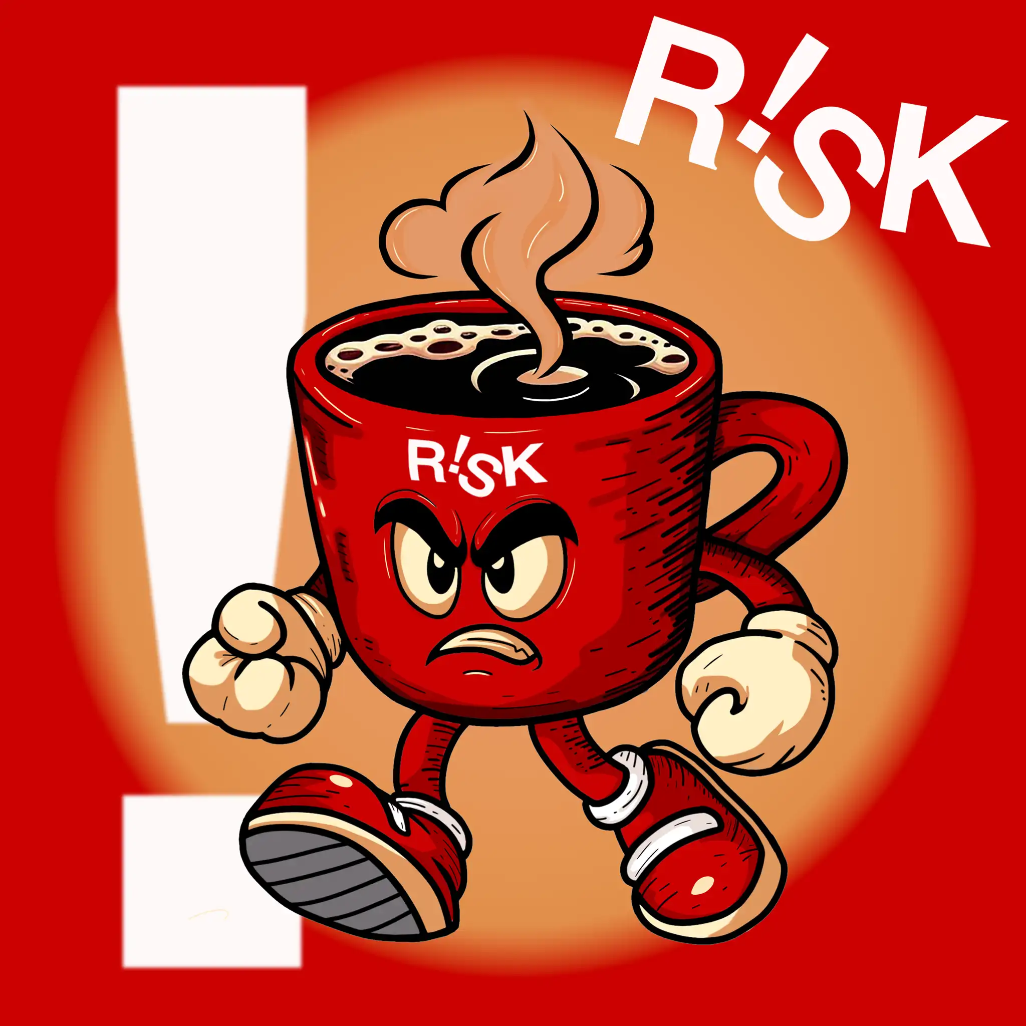
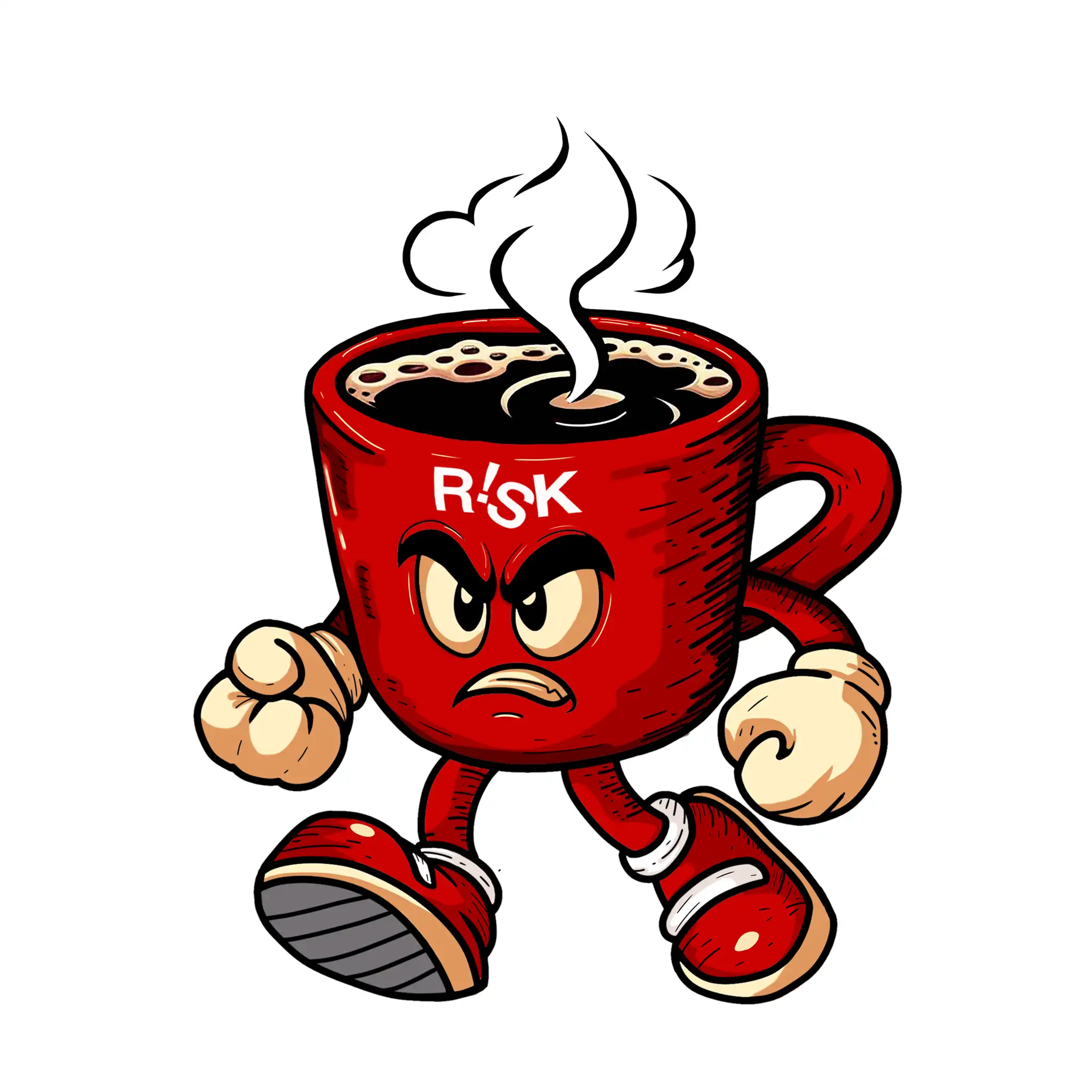
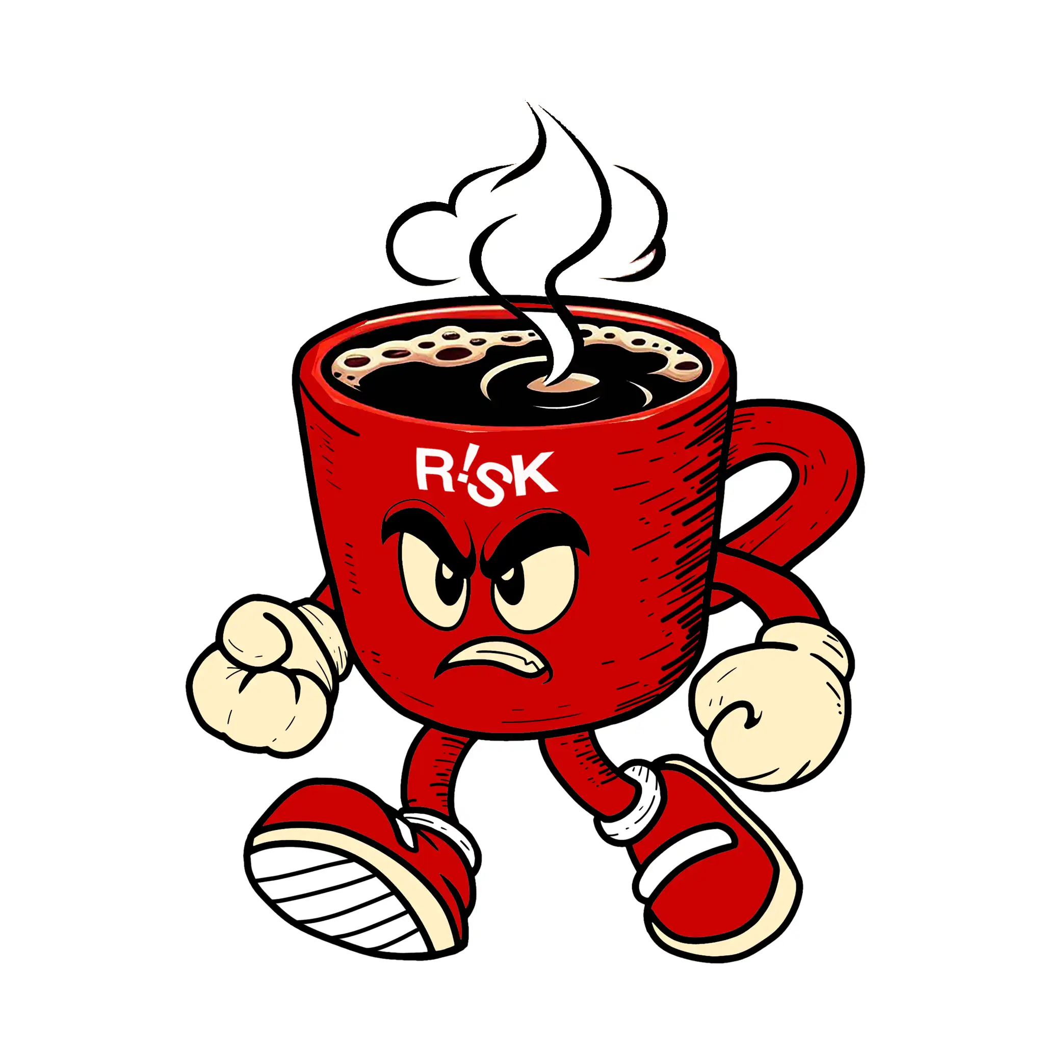
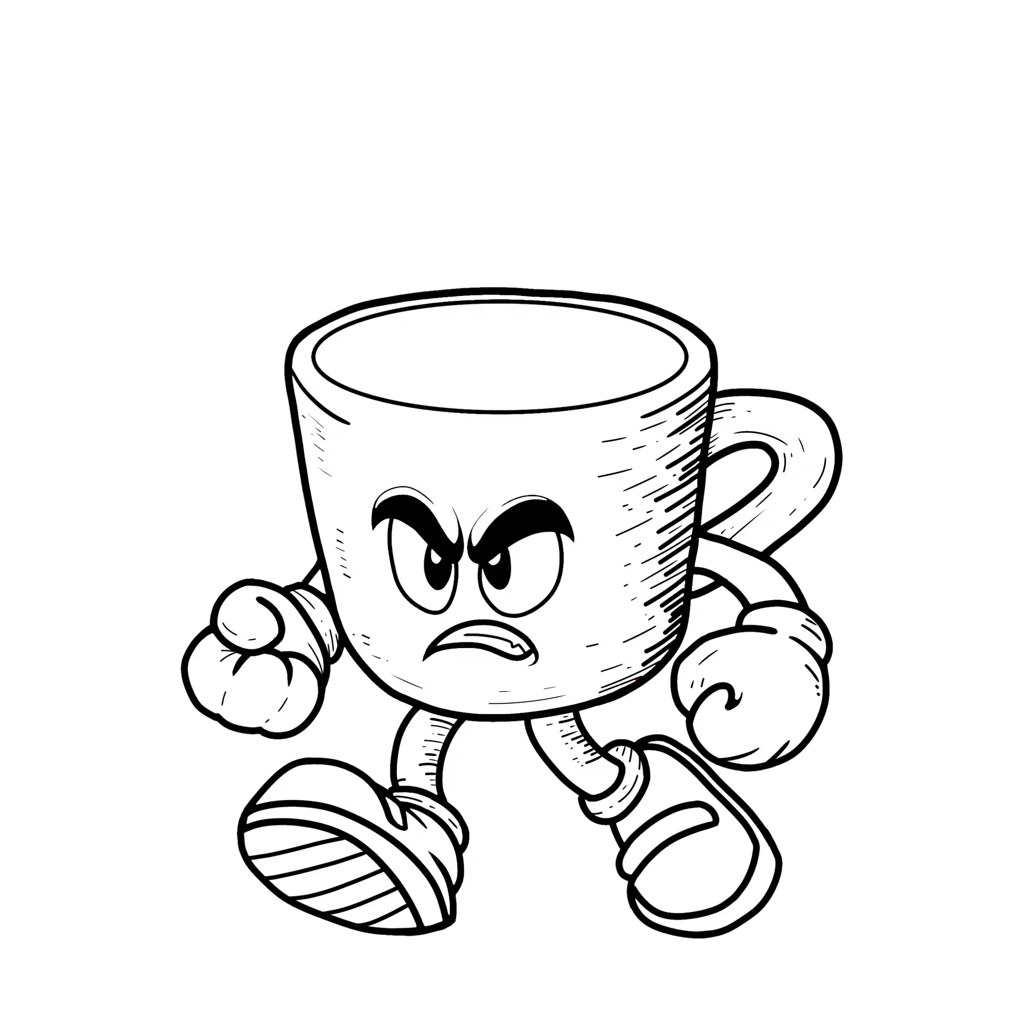
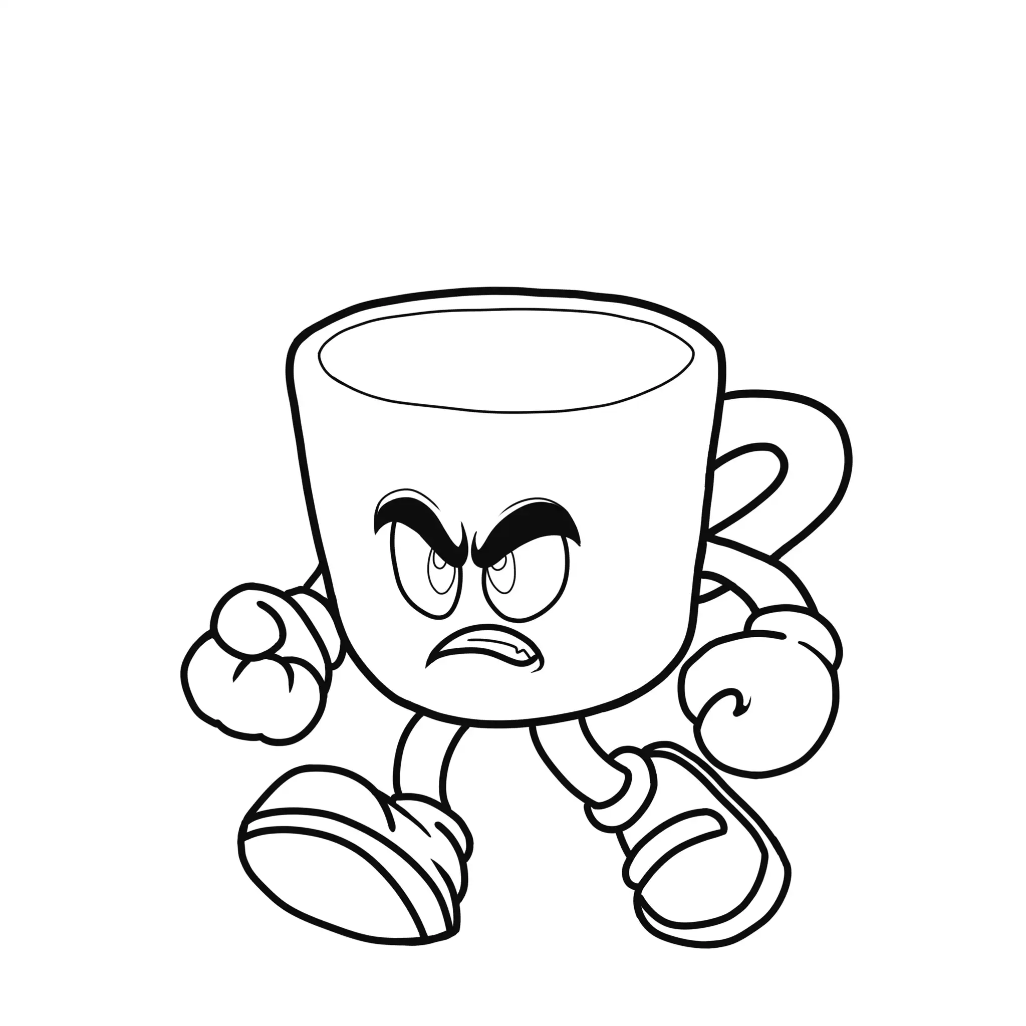
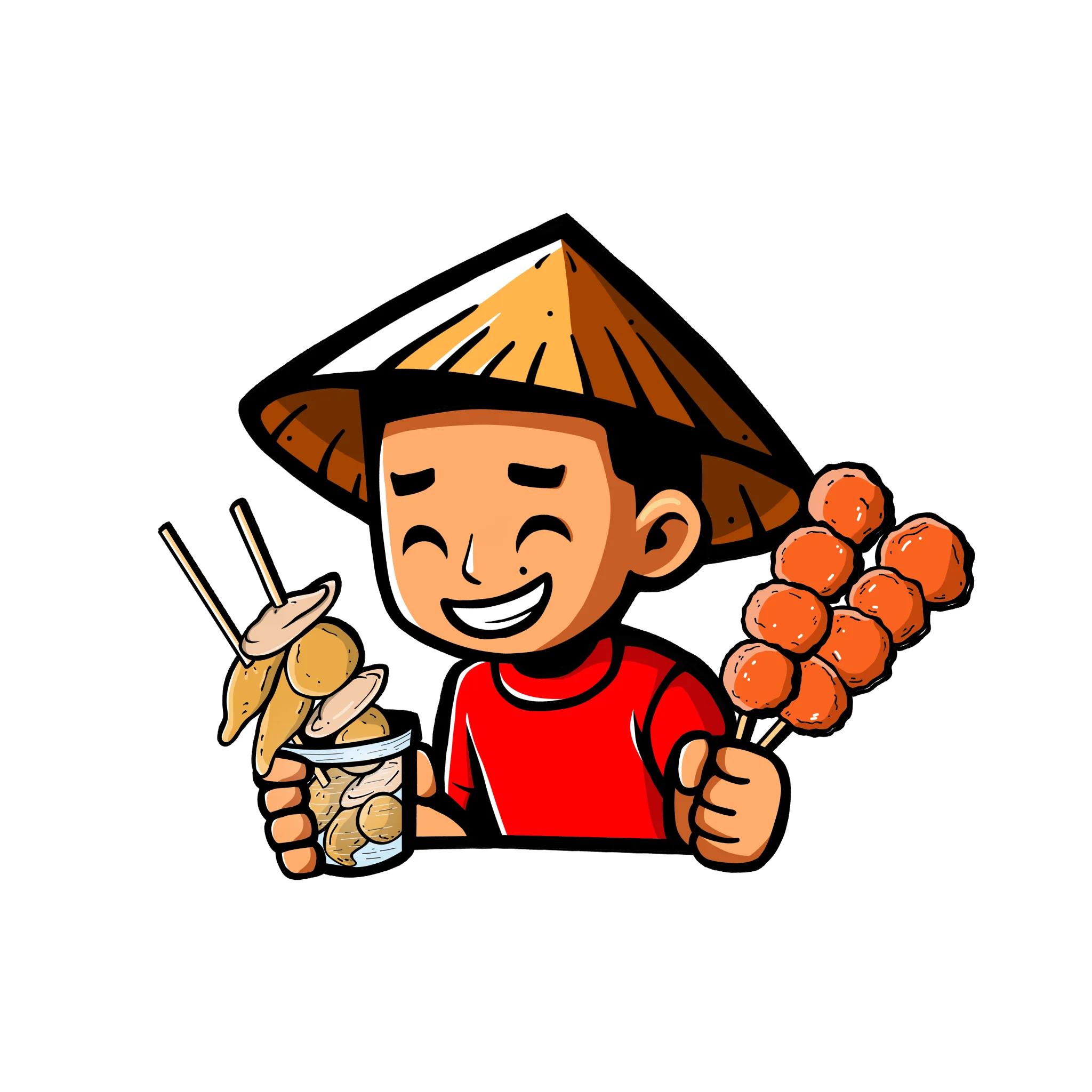
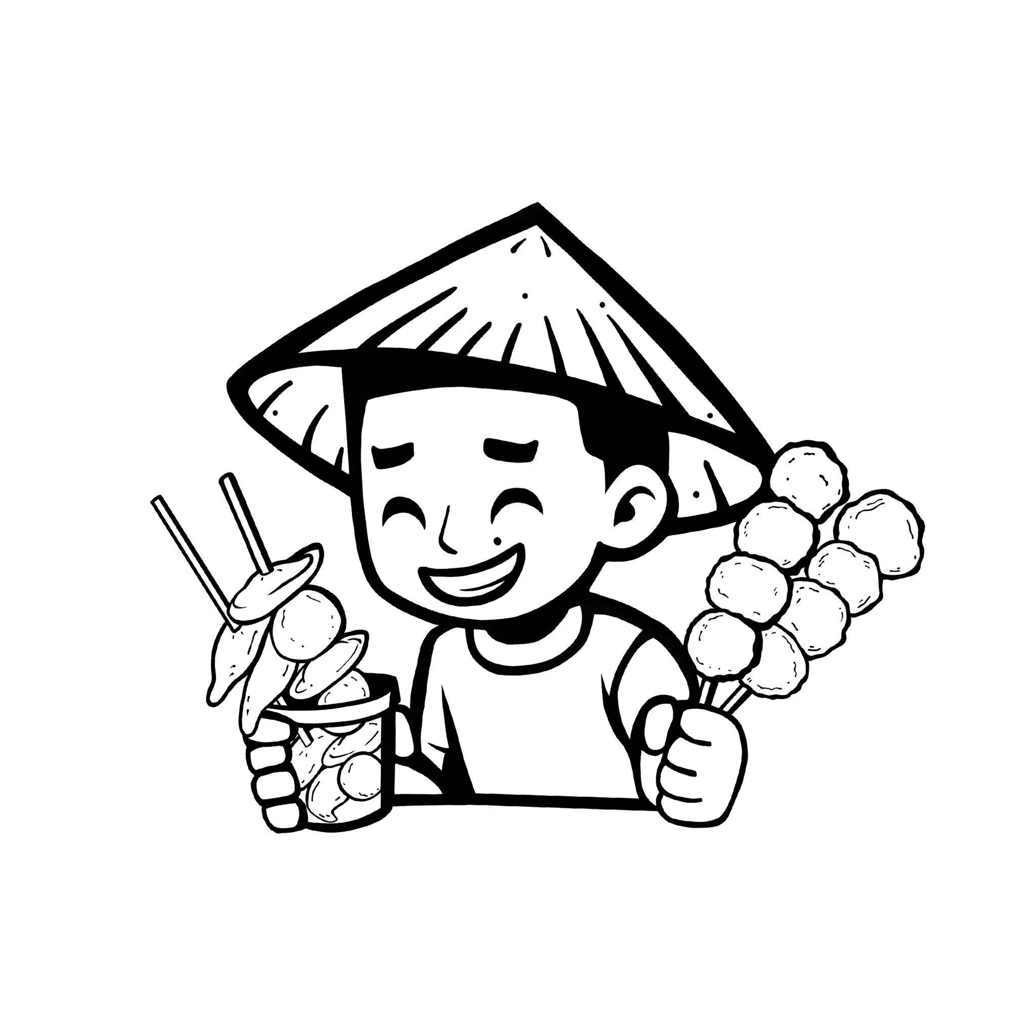
Angry Cup
Client: Risk Coffee Roastery
Project Type: Merchandise Artwork
The idea for Angry Cup started as a casual conversation with Kert-Jan Tabaña, owner of Risk Coffee Roastery. He jokingly mentioned how cool it would be to have an artwork for future merchandise, but there was no formal brief, concept, or creative direction behind it.
As a fellow member of Cebu’s coffee community and a friend of Kert, I took it as a personal creative challenge. Looking at Risk’s strong presence in the local coffee scene, I was inspired by how confidently they approached coffee brewing and stayed true to their craft.
That personality became the foundation of the artwork. The result was Angry Cup — a bold and aggressive coffee cup character that reflected the brand’s confidence, energy, and passion for specialty coffee. What started as a personal design exploration eventually became the first artwork in Risk Coffee Roastery’s merchandise collection.
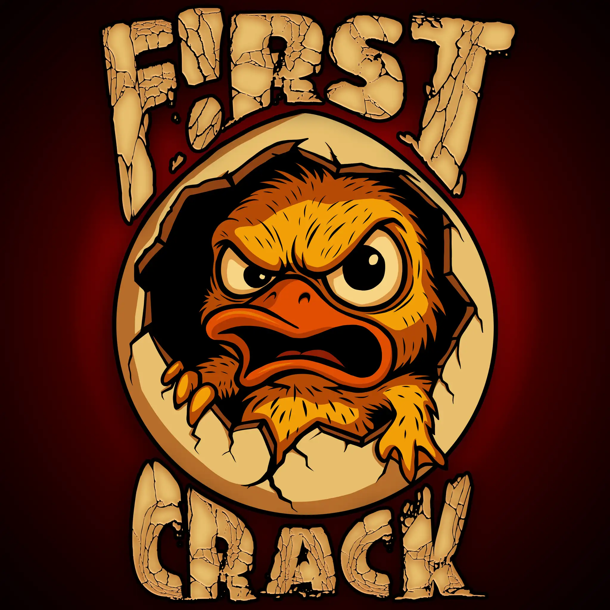
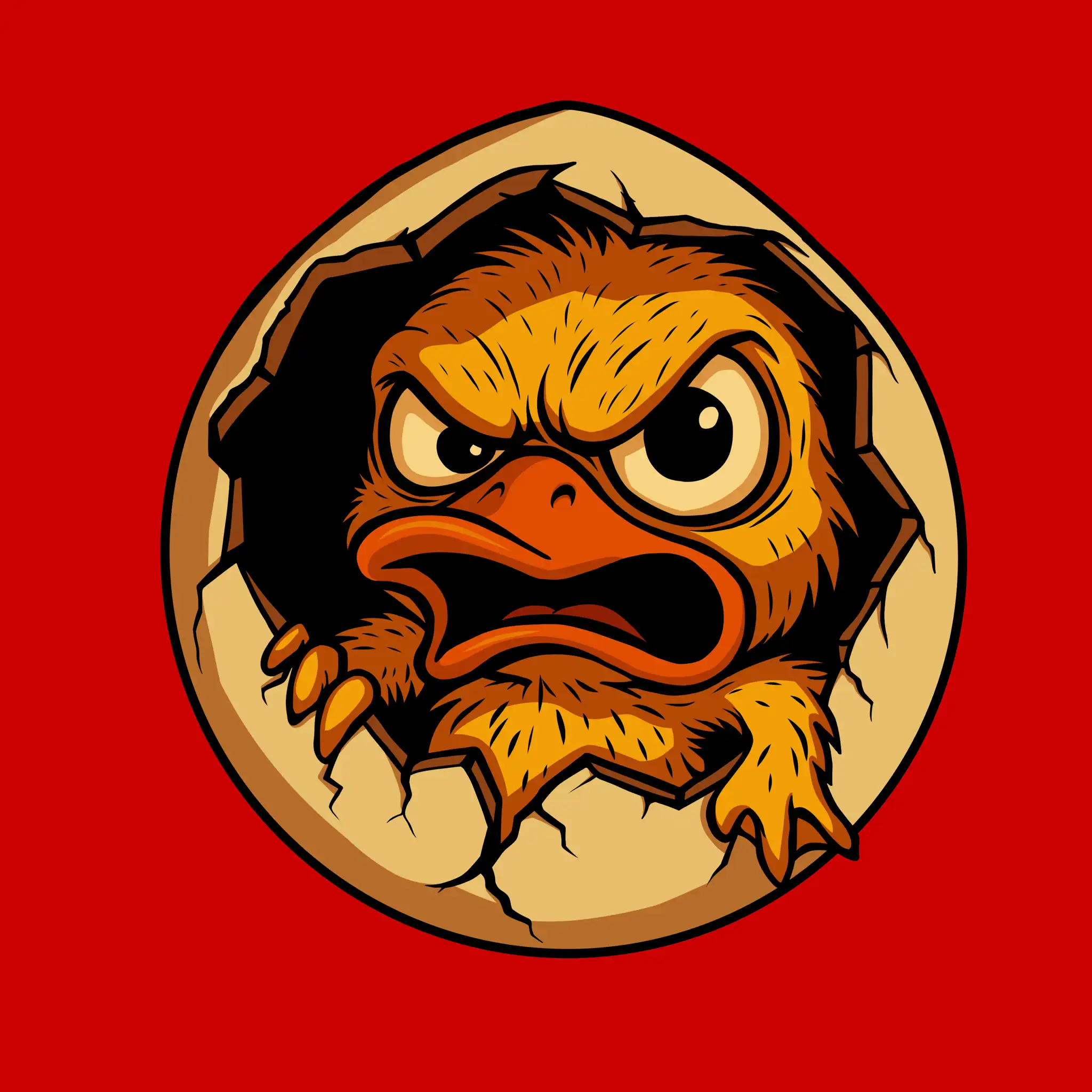
Client: Risk Coffee Roastery
Project Type: Merchandise Artwork
After the success of their first merchandise release, Angry Cup, Risk Coffee Roastery wanted a new artwork that reflected both their coffee culture and Filipino identity.
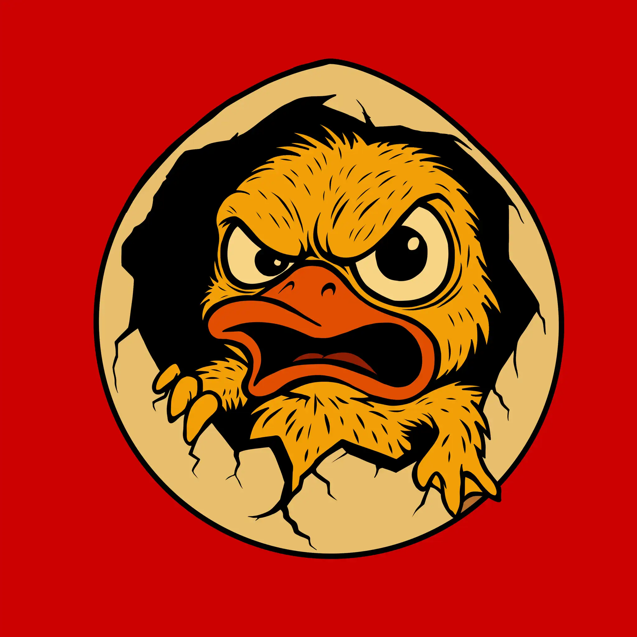
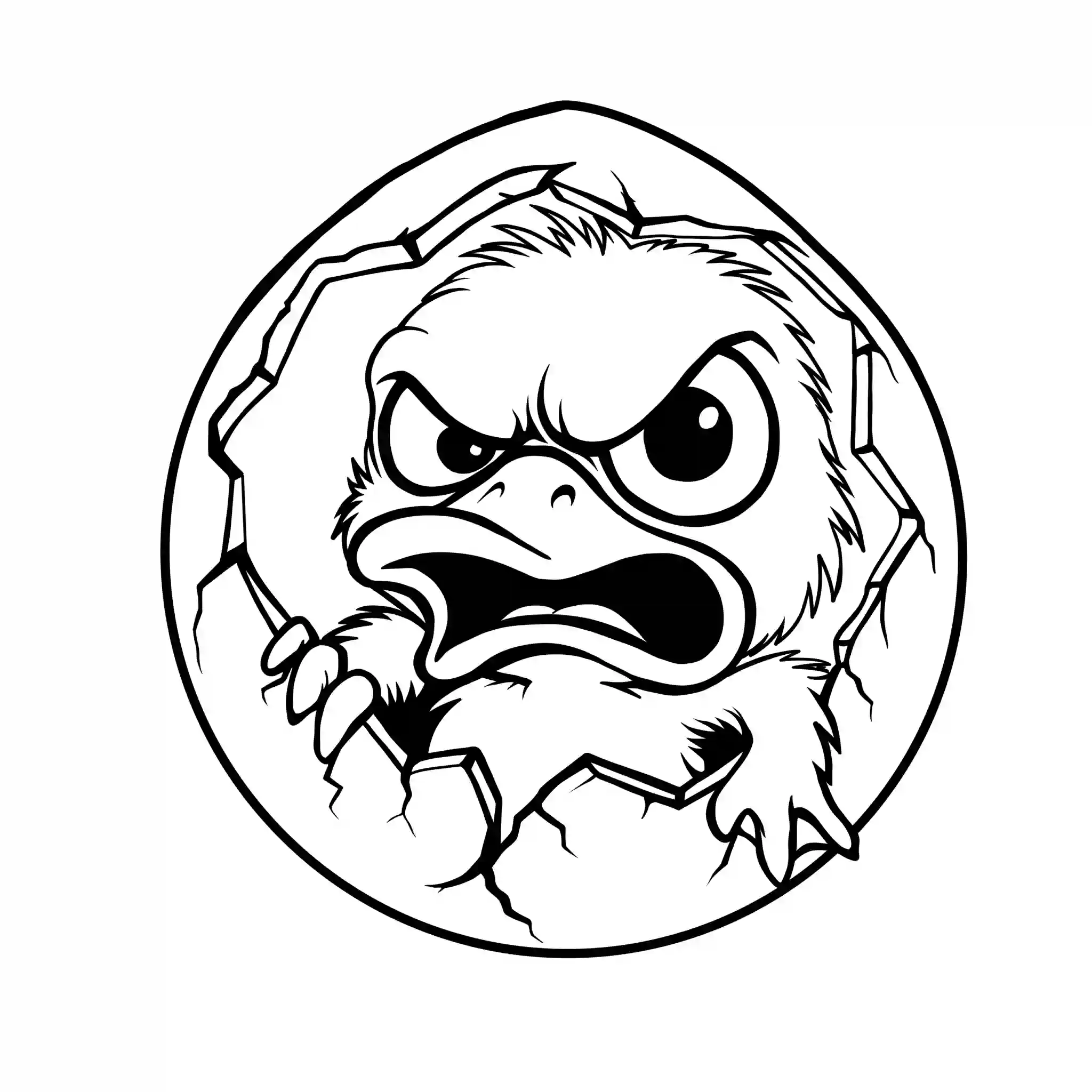
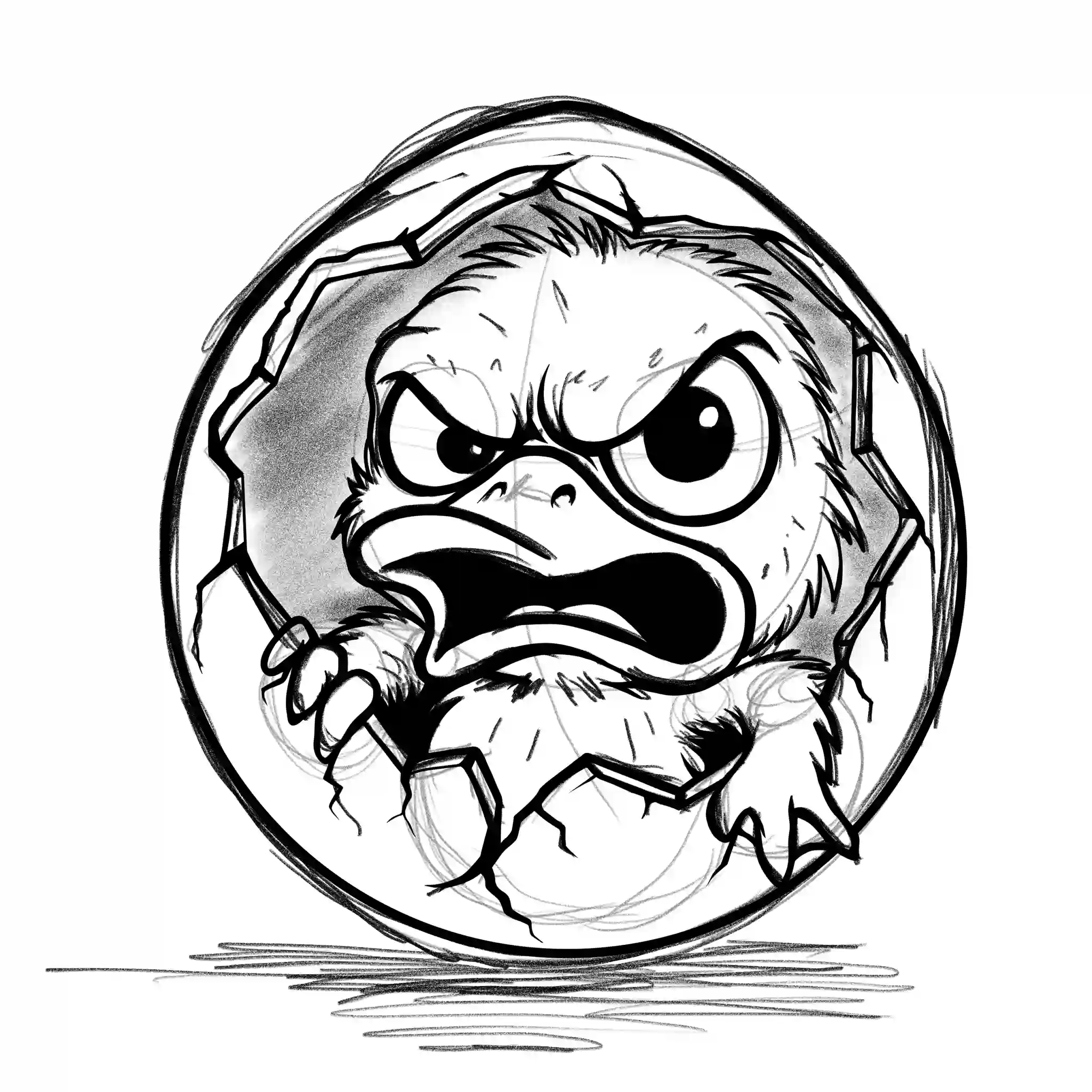
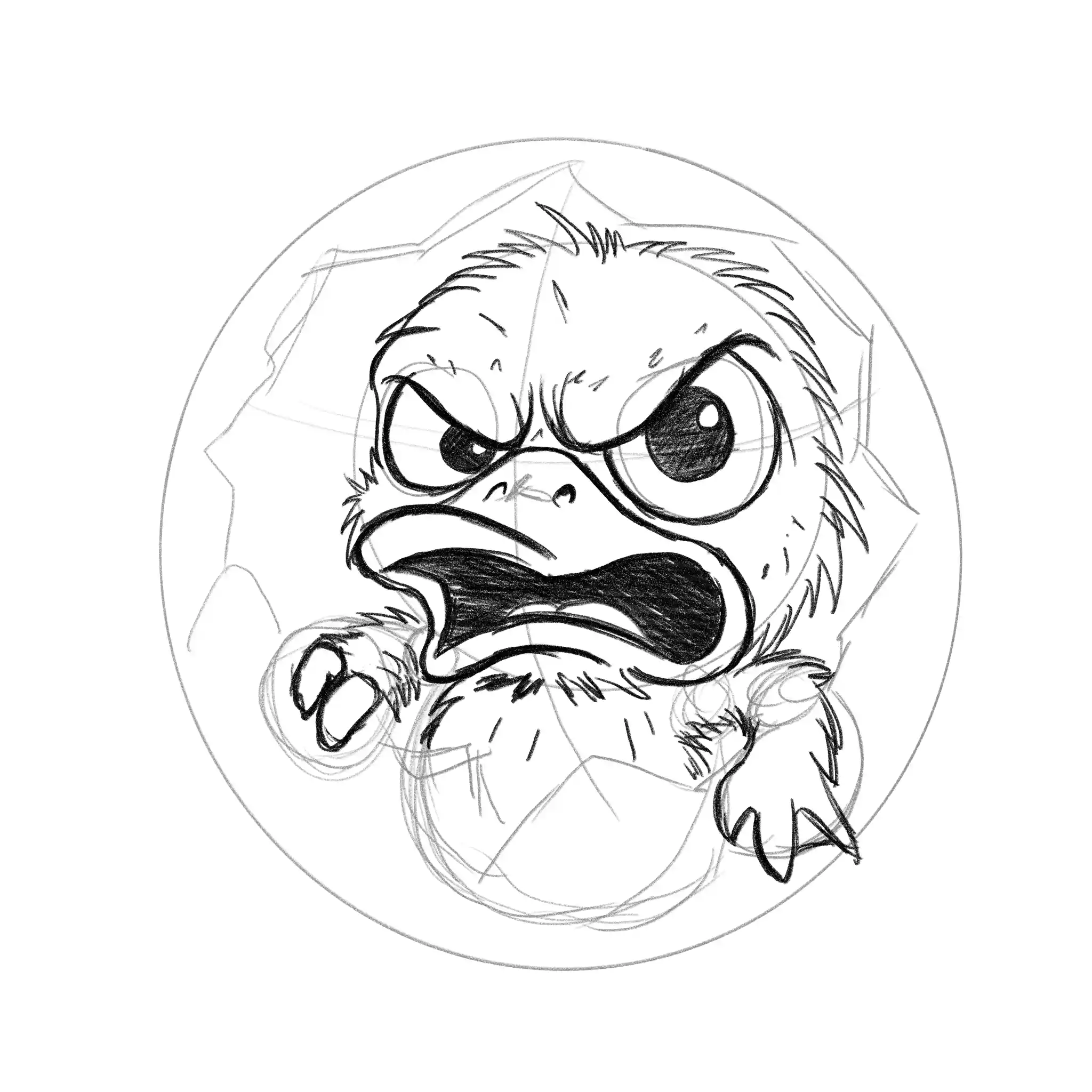
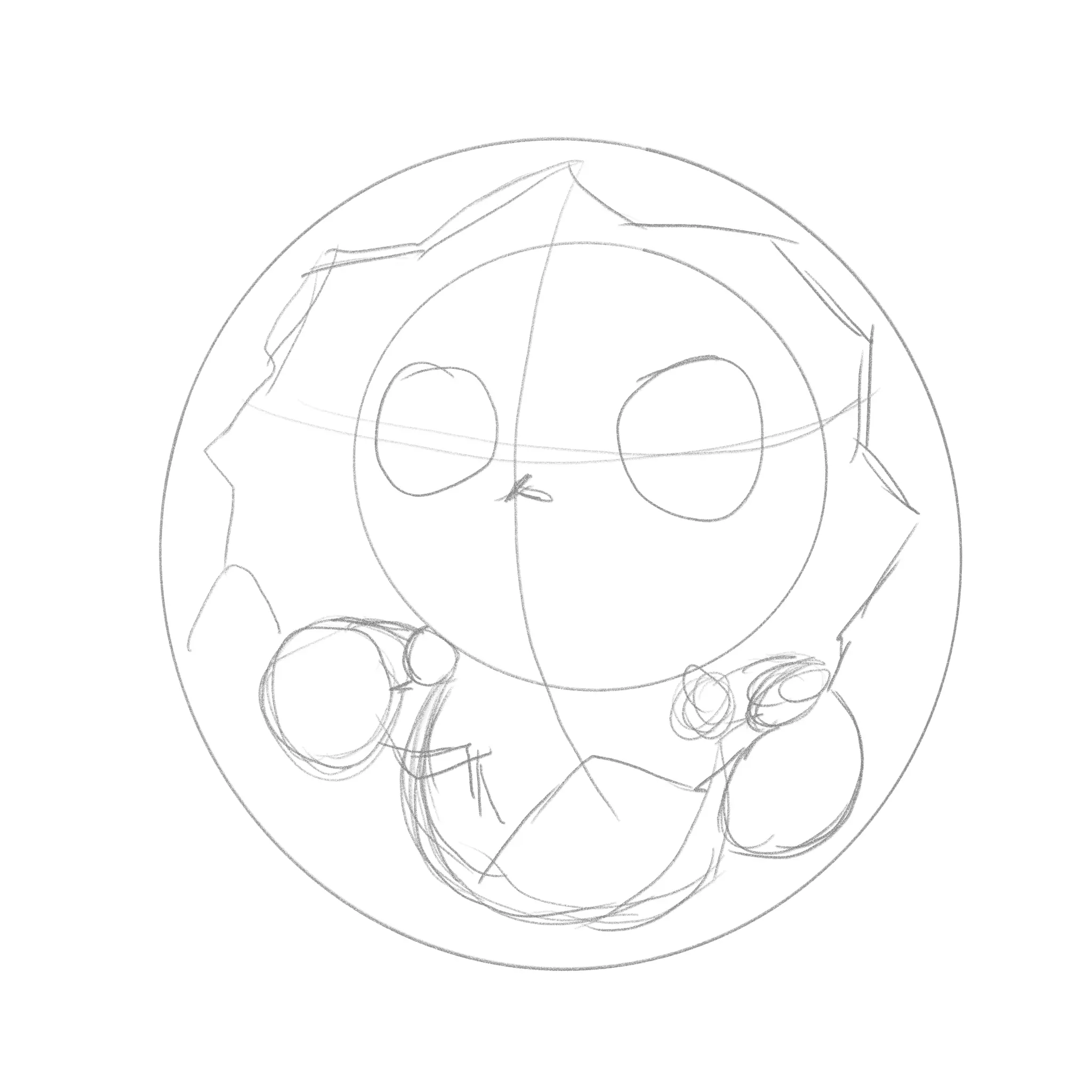
The concept was inspired by “First Crack”, one of the most important stages in coffee roasting, where the beans undergo a transformation that influences their final flavor profile. The owner connected this roasting milestone to Balut, a beloved Filipino street food that must be cracked open before it can be enjoyed.
This playful connection led to the creation of First Crack: Balut Edition — an angry duckling bursting through a cracked shell, combining coffee culture, local humor, and bold character design into a memorable merchandise piece.
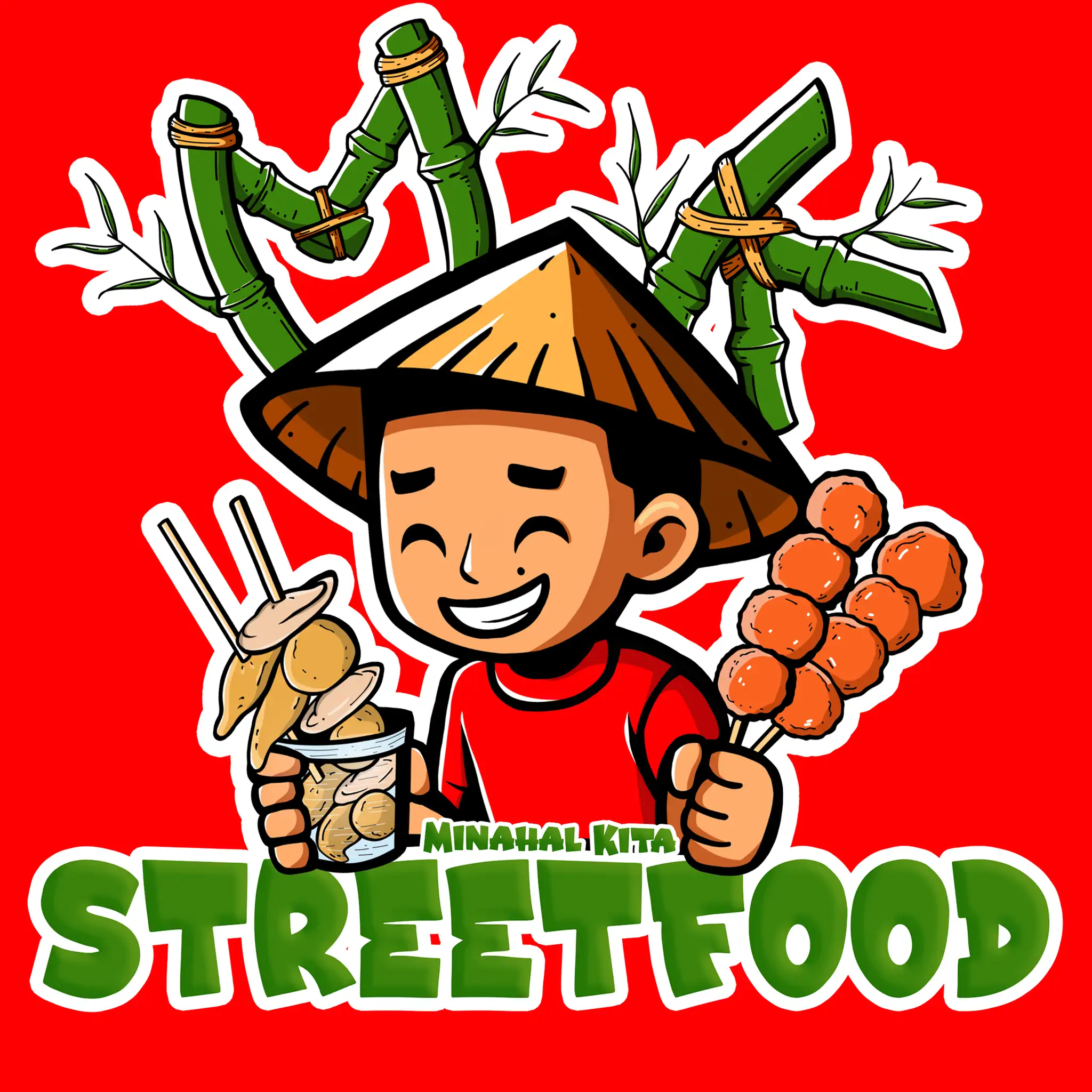
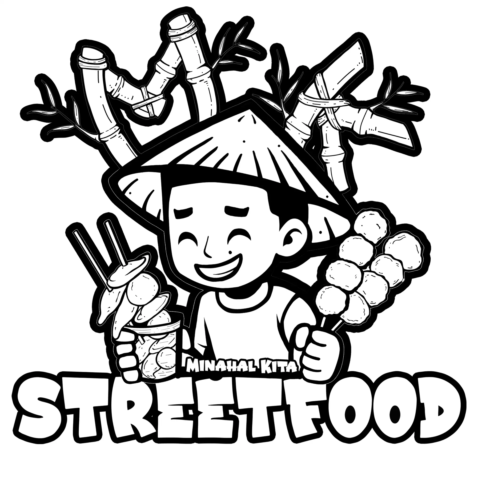
Client: Minahal Kita Streetfood, Baybay City, Leyte
Project Type: Brand Artwork Design
Following the release of my Angry Cup artwork for Risk Coffee Roastery, I was contacted by the owner of Minahal Kita Native Restaurant based in Baybay, Leyte. She discovered my work through the design process video I shared online and was drawn to the bold illustration style and storytelling behind the project.
She approached me with a meaningful vision, to create an artwork in honor of her late brother that could become part of her brand and be featured on her street food pop-up cart during events and celebrations.
Through our discussions, we explored ideas that would capture both the personality of the business and the memory she wanted to preserve. The process was collaborative, smooth, and built on mutual trust from start to finish.
What made this project special wasn’t just the artwork itself, but the opportunity to help bring a personal story to life through design. As Nomadore Studio, I was truly honored to be chosen to transform her vision into something meaningful for her brand and family.
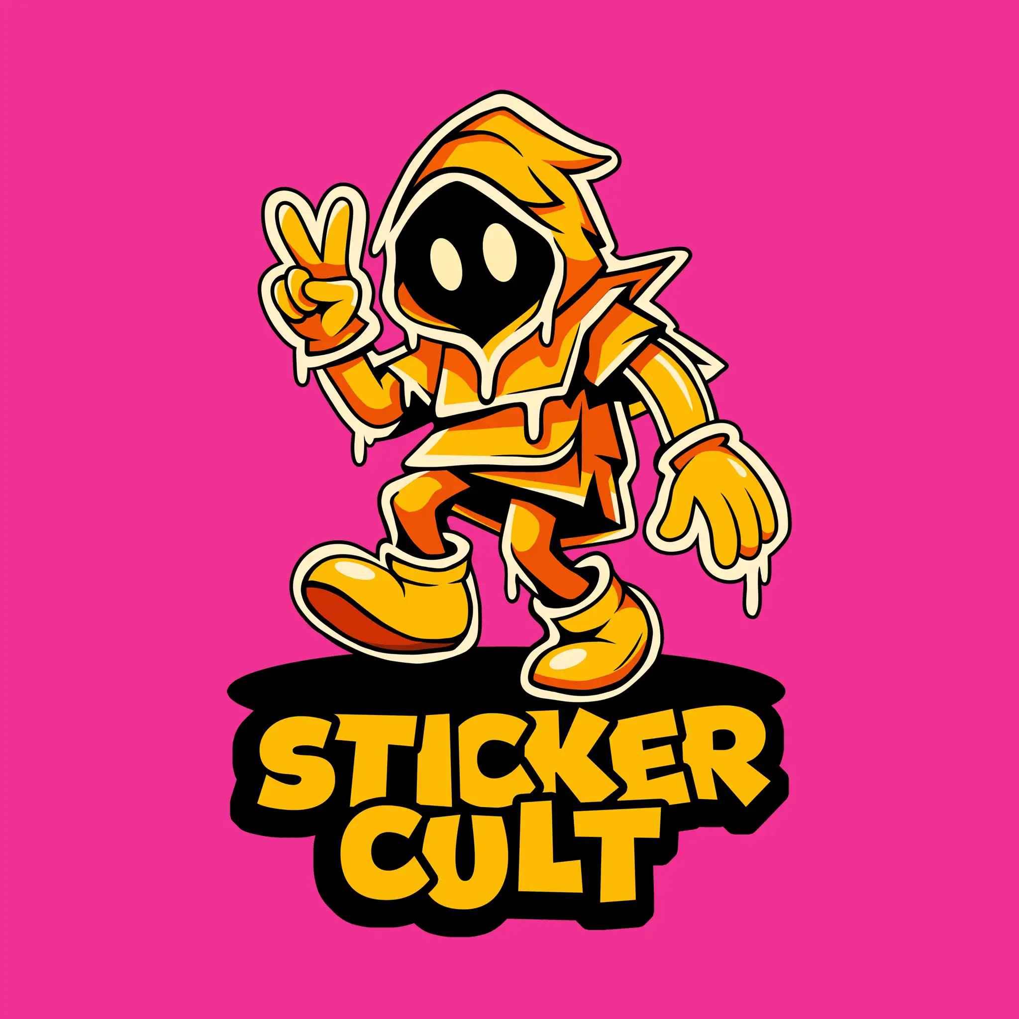
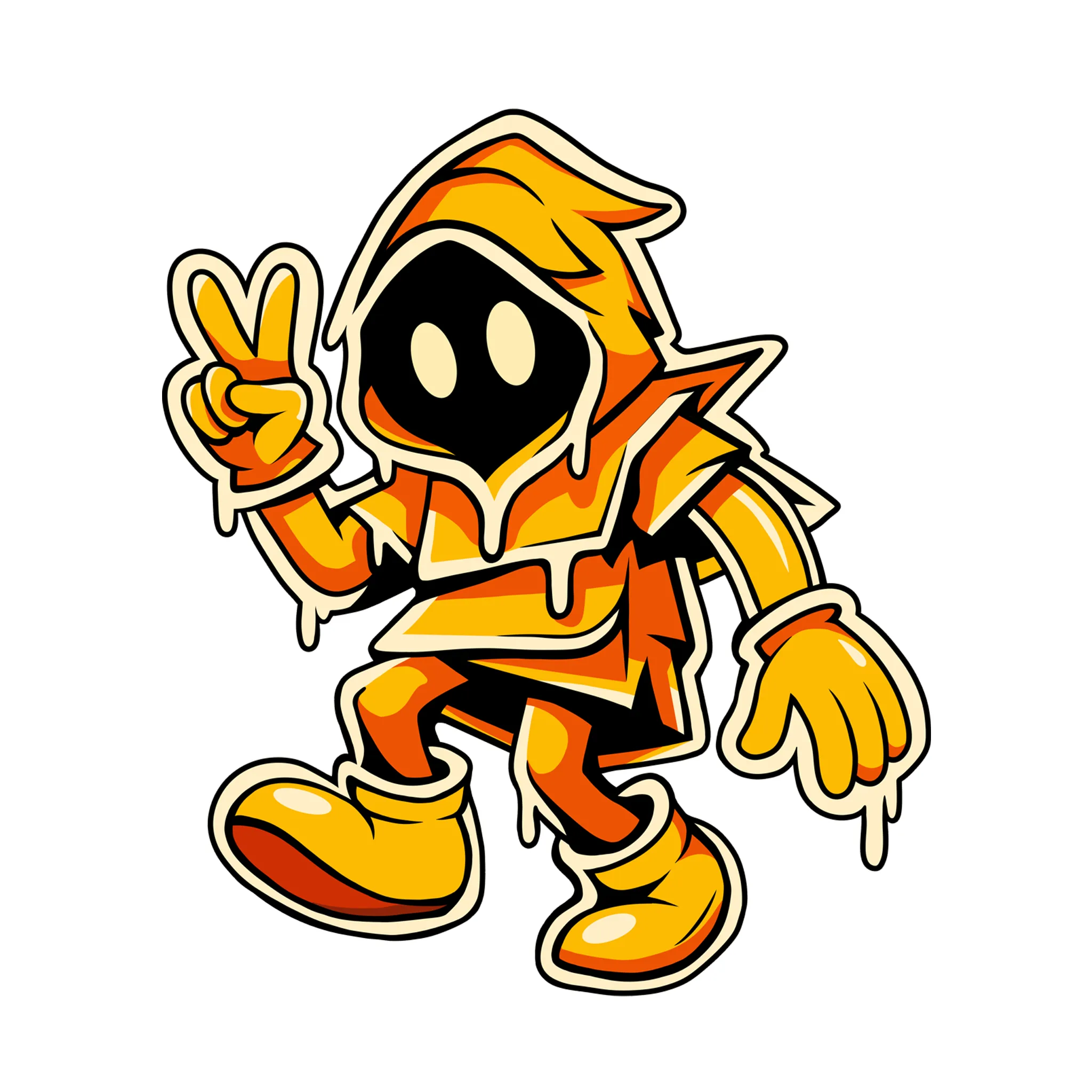
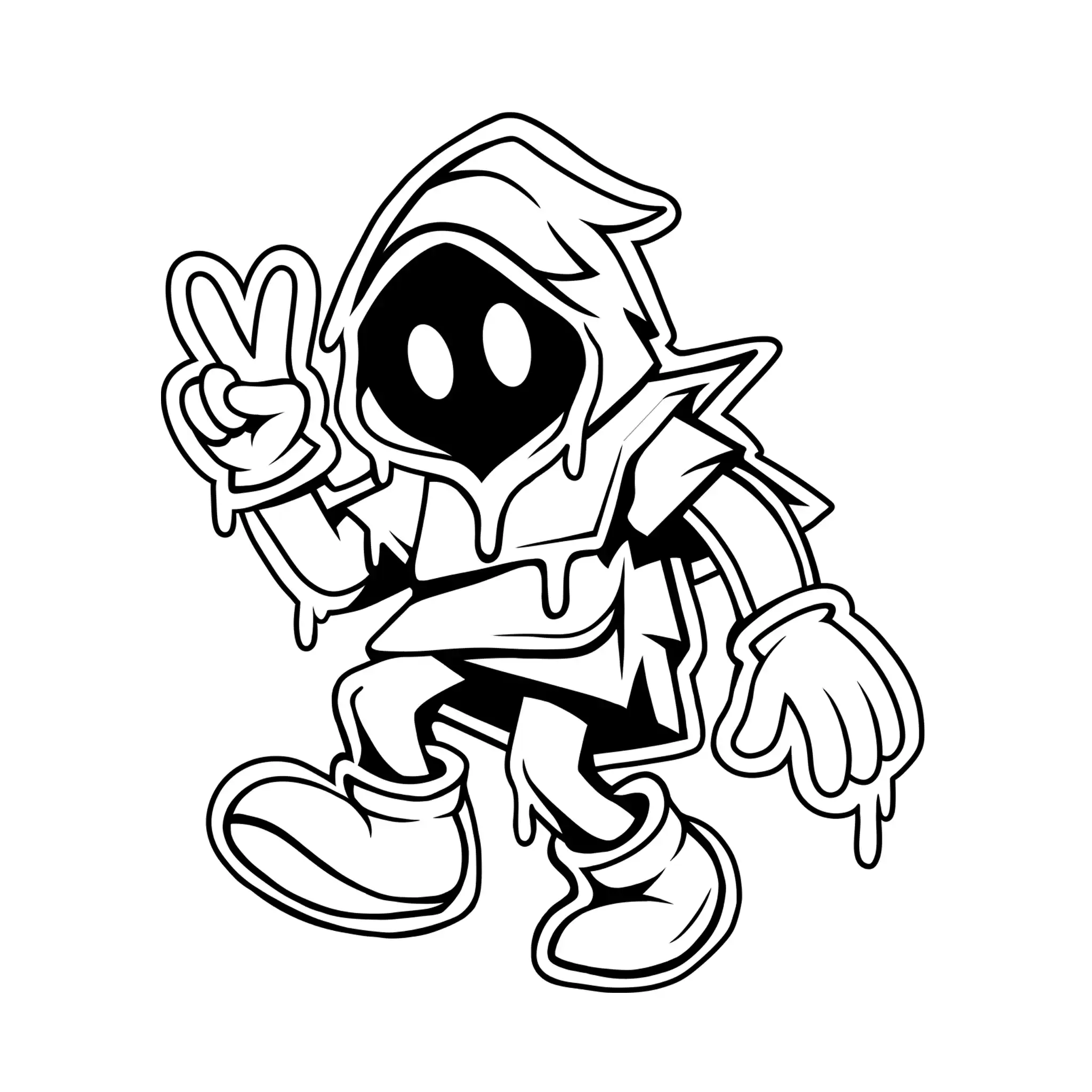
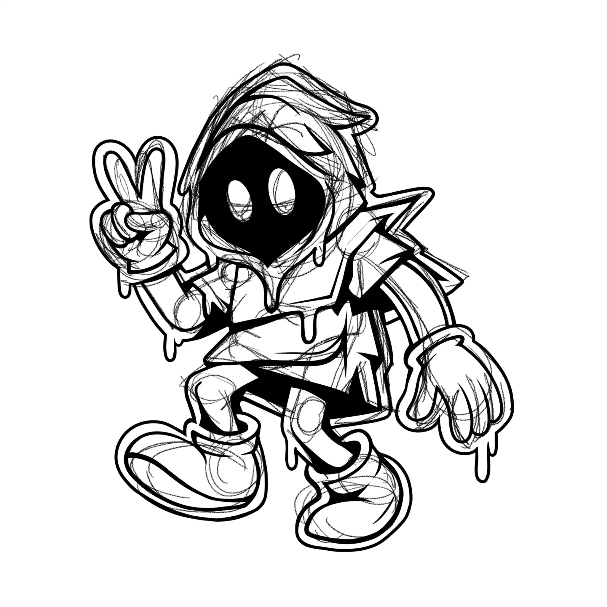
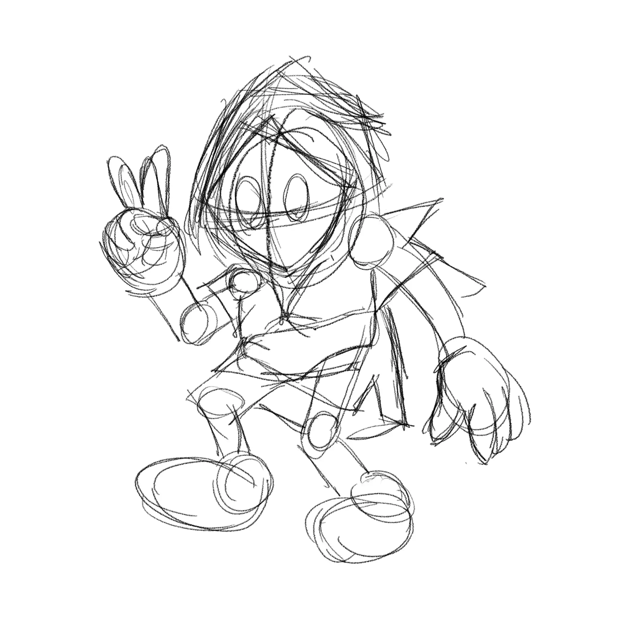
Client: Sticker Cult
Project Type: Brand Artwork Design
Sticker Cult approached me while preparing to launch their printing business and needed artwork that could help establish a unique identity for their brand. While they were already focused on providing custom printing services, they wanted a visual character that would represent their passion for street art, stickers, and creative expression.
During our discussions, they shared their vision of a mysterious hooded spirit character that felt artistic, playful, and instantly recognizable. Together, we explored different creative directions before settling on a mascot that captured the underground energy and personality of sticker culture.
The final artwork became part of Sticker Cult’s early brand presence, combining bold colors, strong shapes, and a memorable character design that could be used across marketing materials, merchandise, and future promotional content.
What makes this project especially meaningful is the relationship that grew from it. Since completing the artwork, Sticker Cult has continued to collaborate with me on various creative projects for their clients. Over time, we built a strong partnership where I help develop artwork and visual concepts while they bring those designs to life through their printing expertise.
LOGO PROJECTS
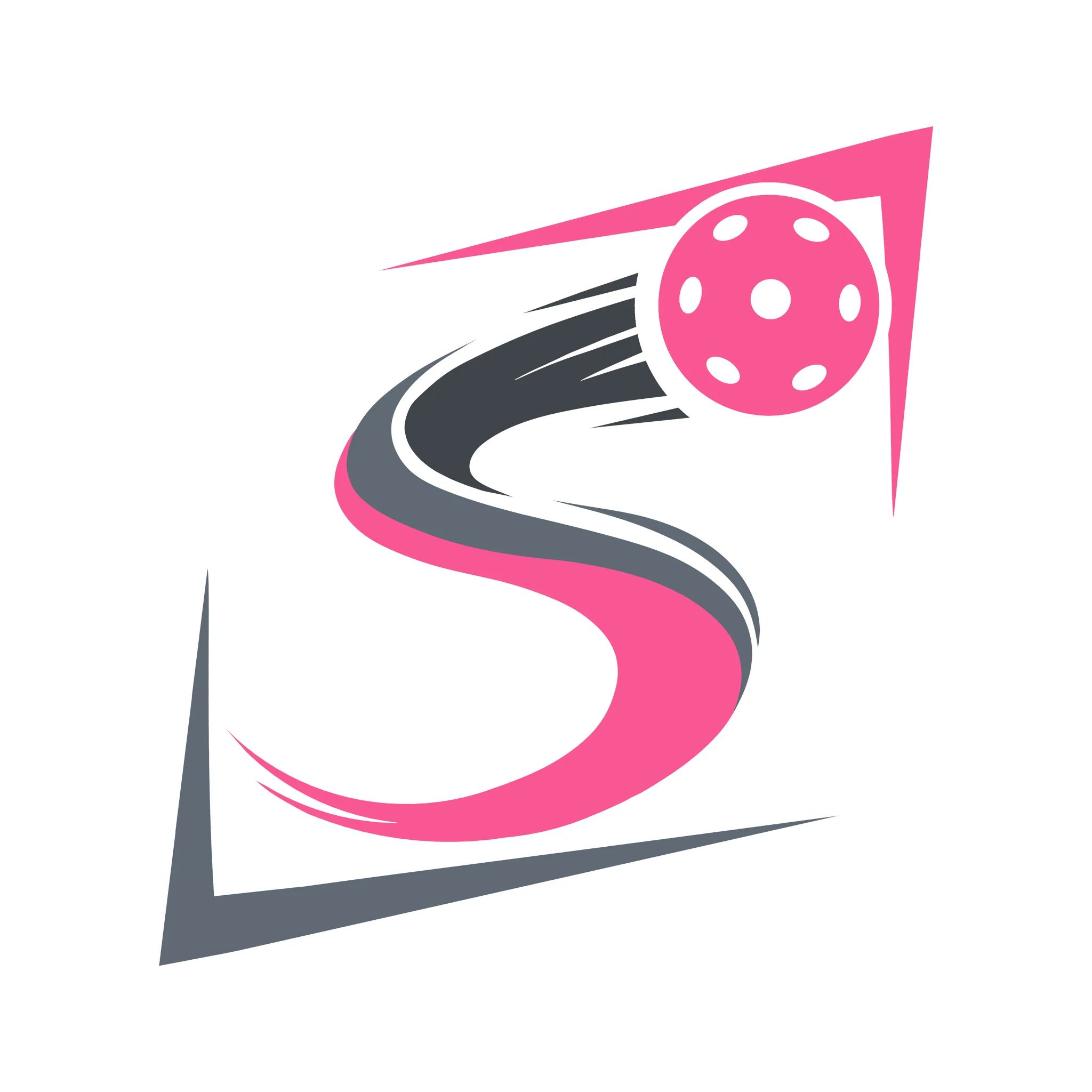
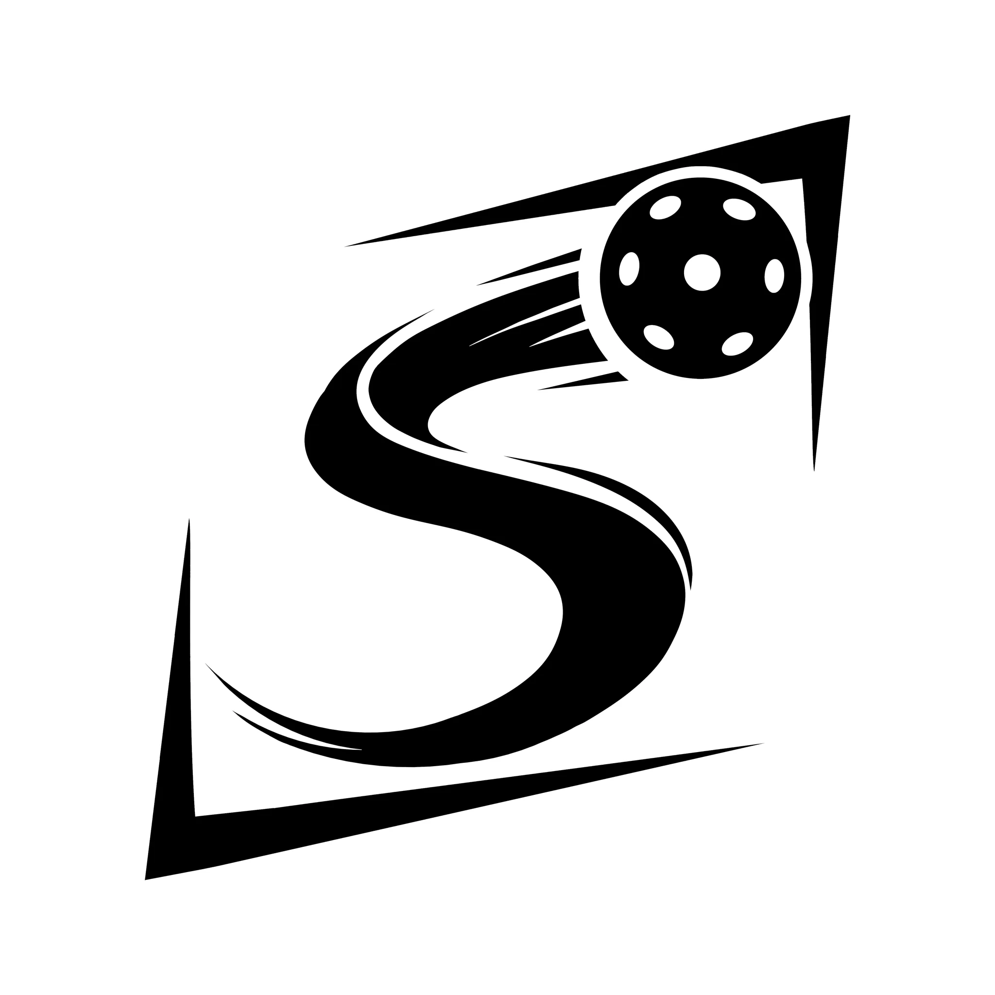
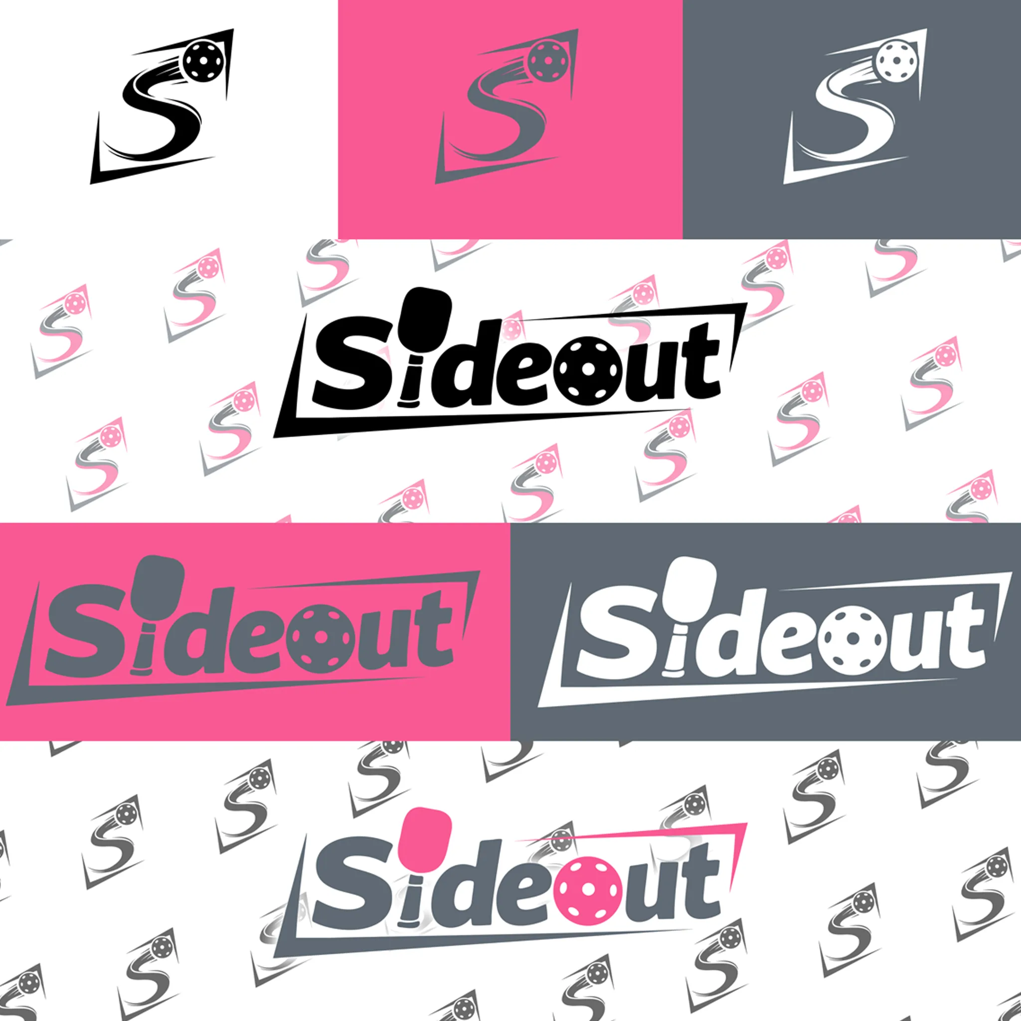
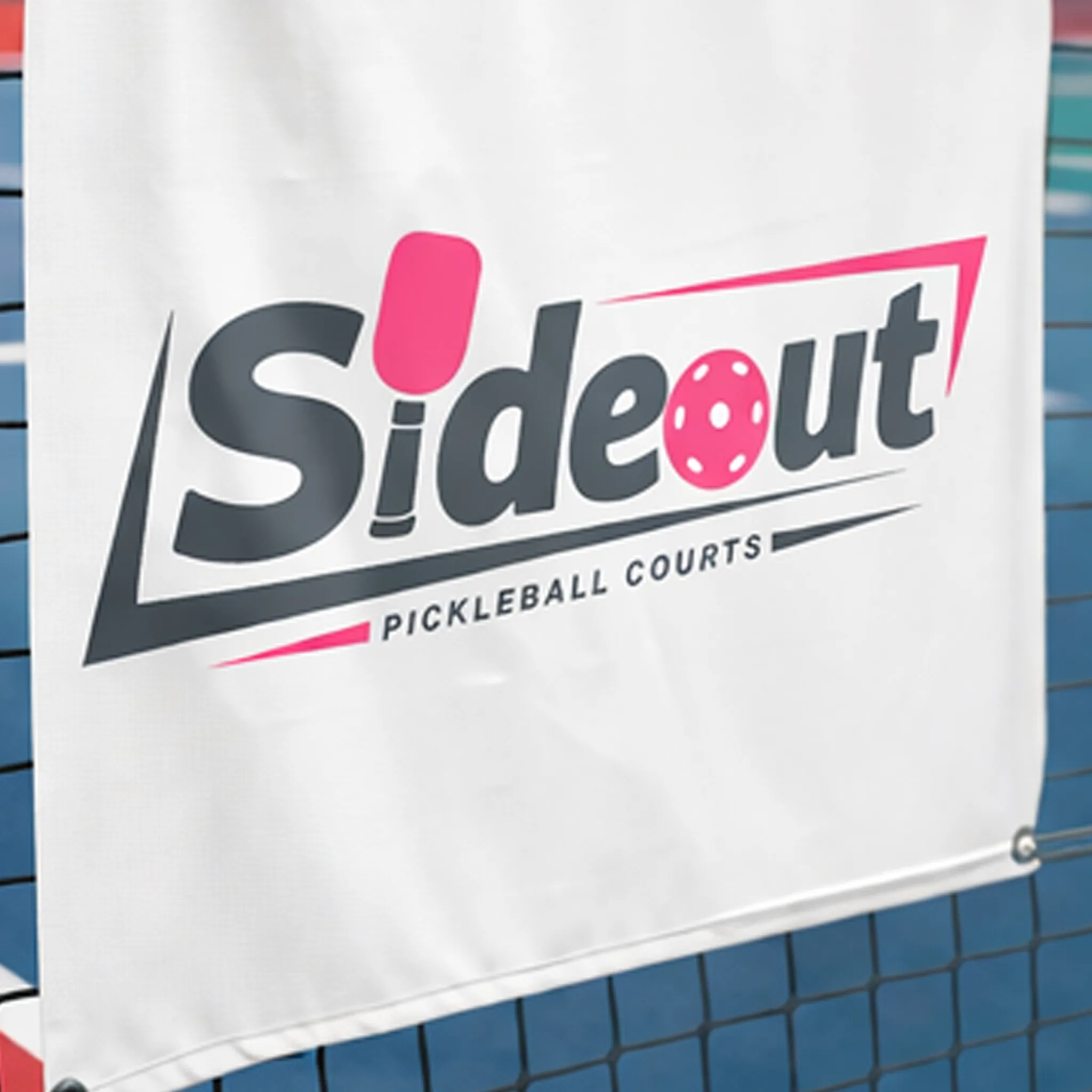
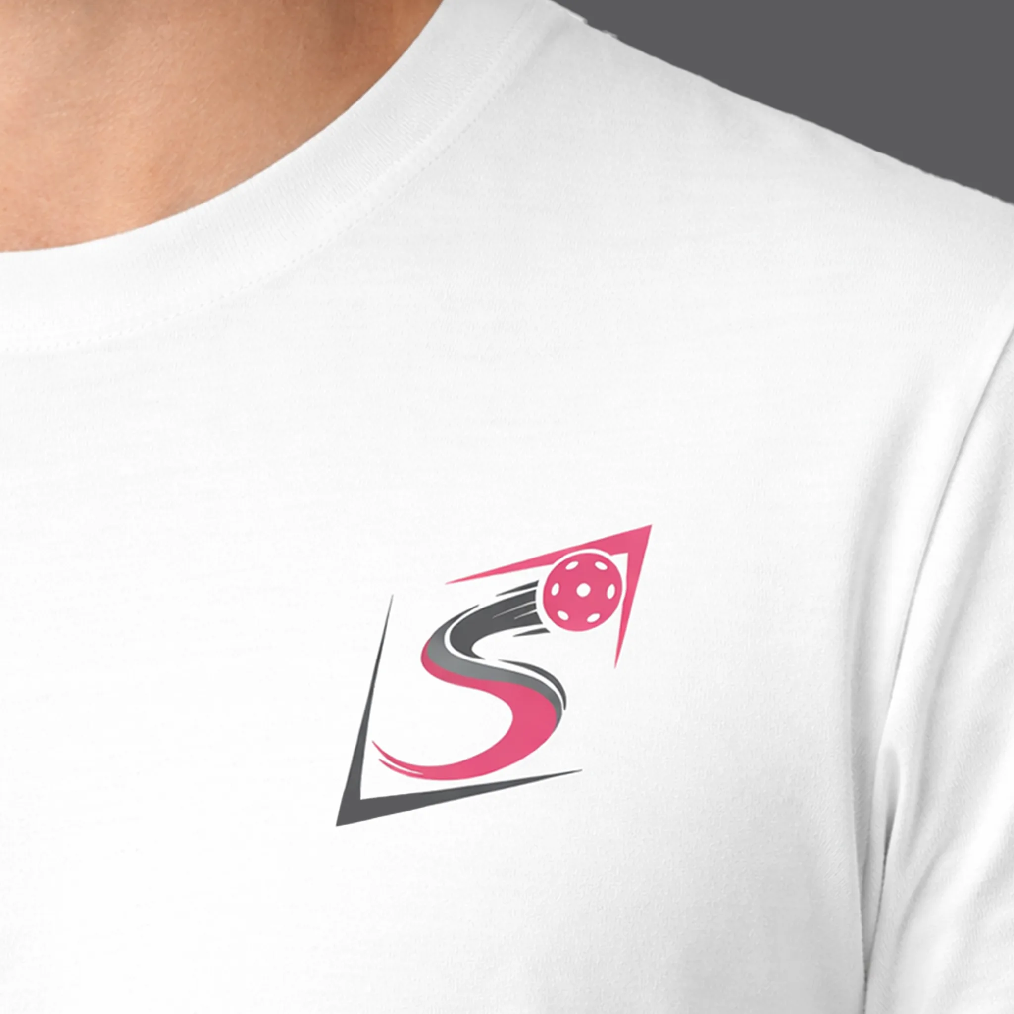
Sideout Pickleball Courts
Client: Sideout Pickleball Courts
Project Type: Brand Identity & Logo Design
Sideout Pickleball Courts approached me with the goal of creating a logo that would reflect the energy, movement, and competitive nature of pickleball while remaining clean, modern, and easy to recognize.
The challenge was to develop a visual identity that instantly connected with the sport while helping the brand stand out in a growing pickleball community. Through multiple concept explorations, we focused on combining the letter “S” with motion-inspired elements and a pickleball icon to create a mark that feels dynamic and memorable.
The final identity features a custom “S” symbol that represents movement and speed, paired with a pickleball element that immediately communicates the brand’s industry. The result is a versatile logo system designed to work across court signage, apparel, merchandise, social media, and future brand applications.
This project highlights my approach to brand design, creating identities that are not only visually appealing but also rooted in purpose, recognition, and long-term usability.
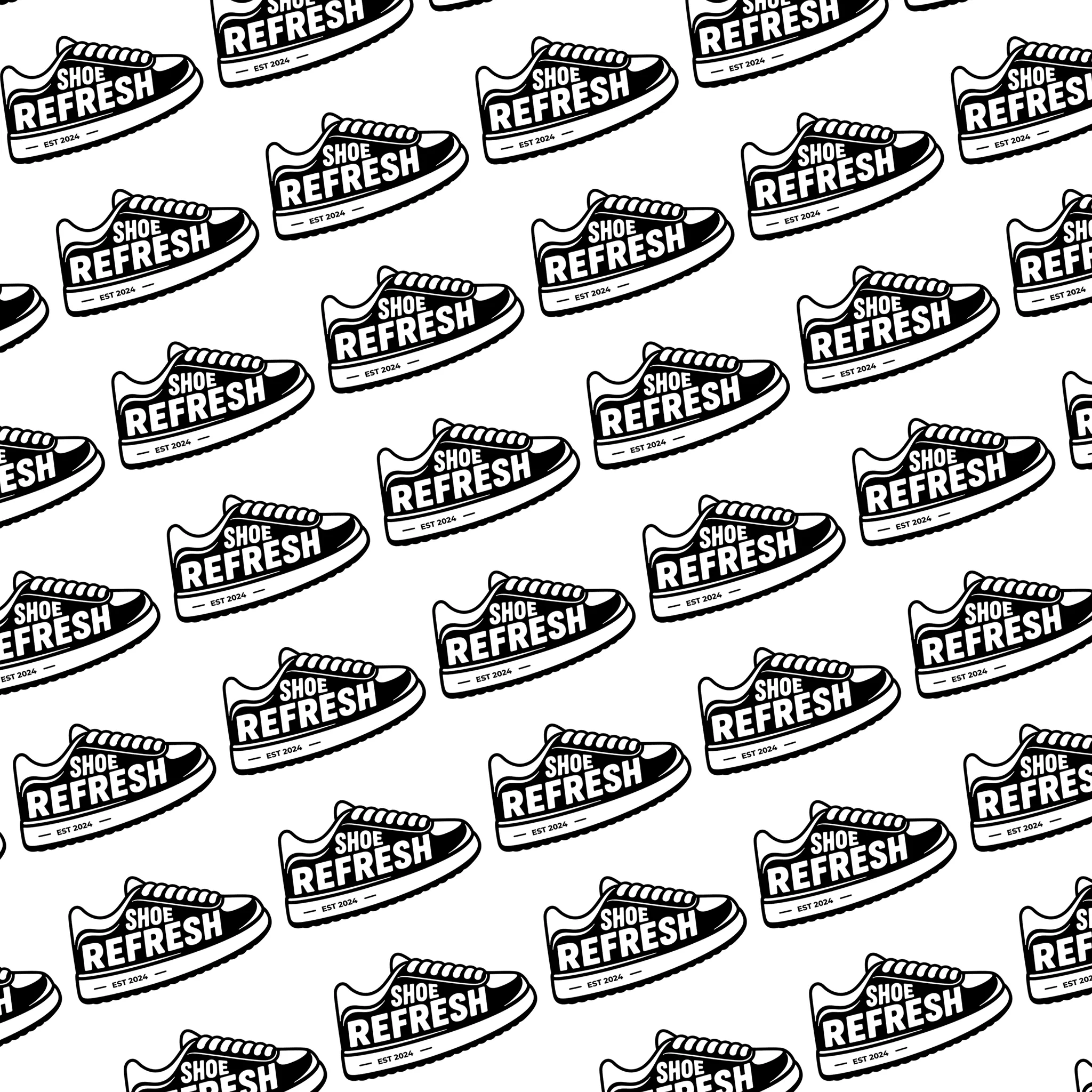
SHOE REFRESH
Client: Shoe Refresh
Project Type: Brand Identity & Logo Design
Shoe Refresh approached me to create a brand identity that would better represent their shoe restoration business and bring consistency across their social media and marketing materials.
The challenge was to develop a logo that was recognizable, versatile, and easy to reproduce across different applications. Inspired by the brand’s focus on sneaker care, I created a custom logo that combines bold typography with a sneaker silhouette to instantly communicate the business’s purpose.
The final identity includes multiple logo variations suitable for digital and print use. Built entirely in vector format, the design can be scaled from stickers and apparel to signage and large-format prints while maintaining clarity and consistency.
The result is a clean, timeless brand identity that strengthens Shoe Refresh’s visual presence and provides a cohesive look across all customer touchpoints.
RMCA - Water Refilling Station
Client: RMCA Water Refilling Station
Project Type: Brand Identity & Logo Design
RMCA Water Refilling Station approached me after discovering my work on TikTok while preparing to launch their new business. Their goal was to create a logo that would be eye-catching, professional, and versatile enough for both large-scale signage and employee uniforms.
The challenge was to develop a visual identity that would stand out while remaining practical for silkscreen printing. After discussing the client’s vision, I created a clean and recognizable logo centered around a water container icon, paired with a bold blue and orange color palette to maximize visibility and brand recognition.
The final identity system includes multiple logo variations suitable for signage, stickers, apparel, and other marketing materials. The client was extremely pleased with the result, noting that the final design exceeded their expectations and brought their vision to life.
This project highlights my ability to create brand identities that balance visual impact, functionality, and long-term versatility.